Typography

Typography is its own visual narrative.

The style echoes our brand, while hierarchy tells the eye where to land. 


Forma DJR

Forma DJR has a fascinating history and story that emulates HP’s own in some ways, conveying engineering and universality but with a subconscious feeling of humanity and expression.

It can best be described as... “Looks familiar, but feels different.”

This font provides the cleanliness, timelessness, and versatility needed for a big brand. But it also has a certain warmth, with enough intricacies, nuances, and quirks to satisfy designers and those with a keen eye, as well as flexibility and technical features.


Type Styles

The HP Brand system includes two type styles with regular weight: Display and Micro. 

Strictly use Forma DJR as the sole HP typeface.

Always apply the regular weight to both type styles. 

Choose between the two with your design discretion. Think big type for less text and small for more.


Style 1—Forma DJR Display Regular

  • Used for BIG type (40pt+)
  • Features tighter spacing
  • Does not work or read well when too small
  • Balances “tight but not touching” for classic style and distinction


Style 2—Forma DJR Micro Regular

  • Used for SMALL type (-40pt)
  • Features looser spacing
  • Ideal for smaller type and longer paragraphs
  • Balances spacing with slight optical adjustments for neat legibility  


Leading

Single line text sits on a baseline. Leading measures between two lines of text, from baseline to baseline. It gives type breathing room so the eye doesn’t strain, especially line after line. 

Forma DJR Display leading should be 80–100% of the type size.

Forma DJR Micro leading should be 100–140% of the type size.

Follow the divider line spacing rules for separating content, such as bulleted lists or type over image layouts.

Leading Percentages

Do

Dont

Use 100% of the overall Micro type, which is 10/10 (font size/leading).

Don’t set the leading at 70% of the type size. It feels cramped.

Leading Consistency

Do

Dont

Keep leading consistent for the same font styles within the same design.

Don’t change up the leading for the same font style within the same design.

  • Leading Percentages

  • Leading Consistency


Capitalization

UPPERCASE or lowercase? Here are some ideas on what to do.

Headlines should be title case—capitalize the first letter of all major words, except prepositions and articles. 

Ex: This Is Title Case


Subheads should be sentence case—capitalize only the first letter of the first word. 

Ex: This is sentence case


Avoid mirroring headlines and subheads capitalization for the same design.

Ex: Headline and subhead both feature title case

Use all caps sparingly for separating same size content, such as specs. 


Hierarchy

Get to the main point and give your layout some order. Hierarchy is achieved with type size, placement, separation, and the use of capitalization.

Use type size as your primary tool to create hierarchy between headings, subheadings, and body copy.

Keep headline word counts as short as possible to work in the larger font sizes.

Information flows top to bottom. Place your most impactful copy first with the largest font to draw in the eye.

Apply color stacking and lines to give visual importance to headlines and break them out from subheads and body copy.

Apply all caps to lists and specs to visually differentiate them from similarly sized content. 


Do’s and Don’ts

Consistency creates familiarity. Help ensure our typography is just as easy to read as it is to recognize. 

Only use true black (#0A0B0B) or white (#FFFFFF) for type over background colors or imagery. Make sure to consider the legibility and high contrast.

Always left align type, aside from a few exceptions --- You can center align when there is a creative trade-off. For instance, product video frames and end cards, posters, or assets that contain strictly text.

Typeface

Do

Dont

Use Forma DJR as the only typeface across all content.

Don’t use a typeface that is not Forma DJR.

Weights

Do

Dont

Always apply regular weight to Forma DJR Display and Micro.

Don’t use different typeface weights than regular.

Styles

Do

Dont

Choose Forma DJR Display for big text and Forma DJR Micro for small text.

Don’t use styles incorrectly or that impact legibility (such as Display being used for small text or Micro bring used for large text).

Type Color

Do

Dont

Feature black type on all background colors/sections.

Don’t use different colors or mix black and white type in the same design—it creates inconsistency and overwhelms.

Capitalization

Do

Dont

Feature all caps sparingly to separate same-size content, such as specs.

Don’t apply all caps universally.

Alignment

Do

Dont

Left align type at all times (center is permitted for creative benefits, such as product video frames or text-only assets).

Don’t right align type.

  • Typeface

  • Weights

  • Styles

  • Type Color

  • Capitalization

  • Alignment

Legal Disclaimers

Legal disclaimers come into play often. Follow our approach, so it’s cited but not part of the central copy.

Use Forma DJR in Micro Regular.

Legal disclaimers should be the smallest type size on the page.

Reduce type color to a 30–50% tint to diverge it from the main copy.

Place the disclaimer in the most discreet spot, so it organically indicates legal language.

Make sure to still punctuate the layout with the HP logo.


Language Support

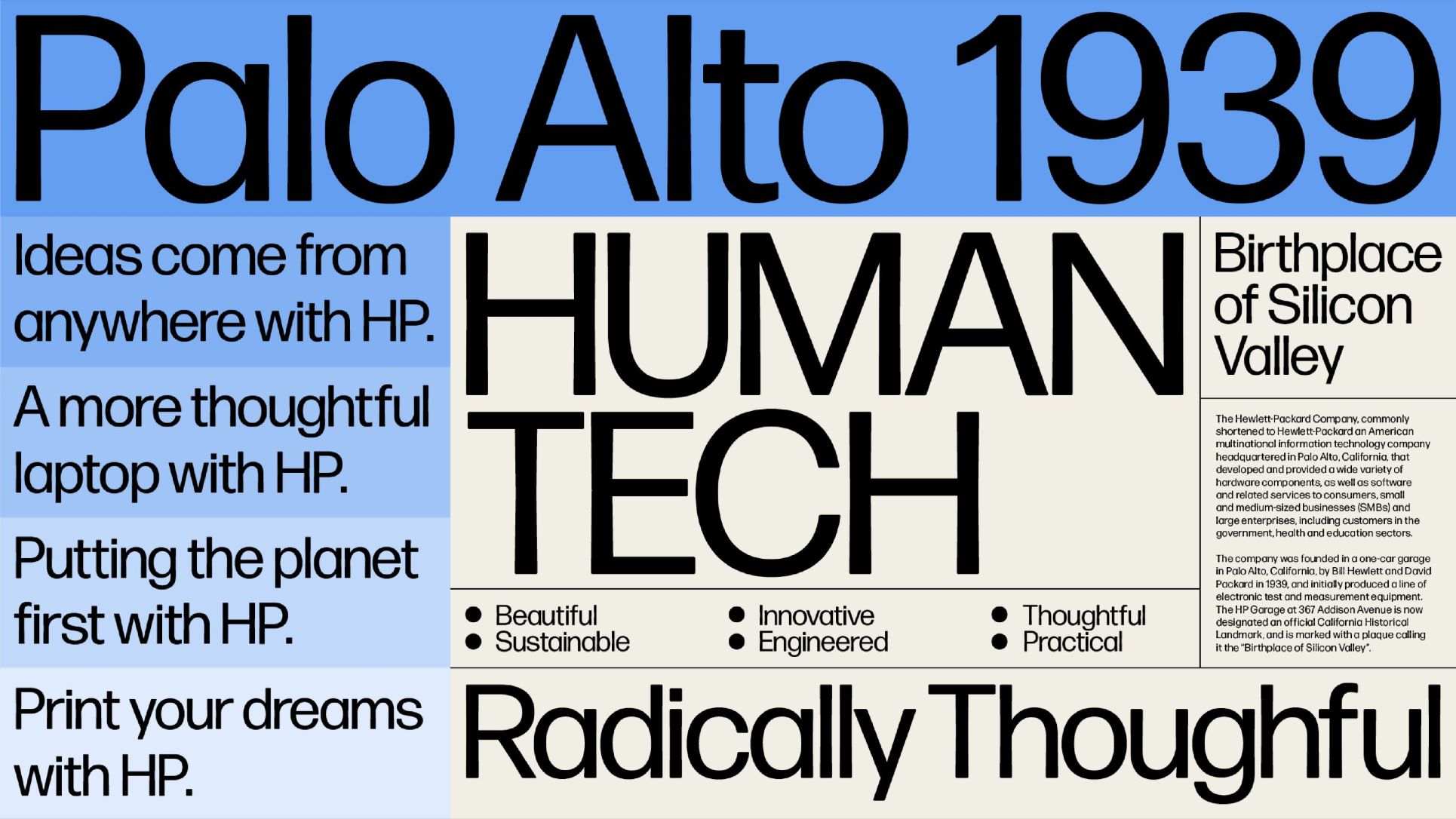
We want to bring our world to our customers. Different language packages will be available along the next 3 months. For more details, reach out to the Brand Central team.

Latin Extended (available)

Latin-1 and Latin Extended-A blocks cover major European languages that use the Latin alphabet: Afrikaans, Albanian, Alsatian, Basque, Bislama, Breton, Catalan, Chamorro, Croatian, Czech, Danish, Dutch, Eastern European, English, Estonian, Faroese, Finnish, Flemish, Franco-Provençal, French, Frisian, Friulian, Galician, German, Greenlandic, Hungarian, Icelandic, Indonesian, Irish, Italian, Kurdish (Latin), Ladin, Latin, Latvian, Lithuanian, Luxembourgish, Malay, Manx Gaelic, Moldovan, Norwegian (Bokmål, Nynorsk), Occitan, Polish, Portuguese, Rhaeto-Romance, Romanian, Romansh, Sami (Inari, Lule, Northern, Skolt, Southern), Scottish Gaelic, Slovak, Sorbian, Slovenian, Spanish, Swahili, Swedish, Tagalog, Turkish, Uzbek (Latin), Vietnamese, Walloon, Welsh, Western European

Cyrillic (available)

Cyrillic is included in the “FormaDJRCyrillic” fonts, which cover the upright, middleweights of the family. These will not only support Russian, but also include Extended Cyrillic and localized forms for Bulgarian, Serbian, and Ukrainian.

Greek, Hebrew and Arabic (available)

HP is commissioning Forma DJR for Devanagari and Thai Loopless.

HP is licensing (Hanyi) for Chinese.

HP is licensing (World Fonts) for Japanese and Korean.

Our flexible design system can accommodate any language. See the localization examples below.


Install Forma DJR

  • HP employees can install Forma DJR from their company designated PCs. Use MyITApps to locate and install the available font packages.
  • Authorized partner agencies can download Forma DJR from Adobe Creative Cloud or reach out to your HP contact to have access to the font packages on HP Asset Hub.